Steps in the Design Process

Step #1
Thumbnail sketch (a series of simple
and rapidly drawn designs for a layout)
Once you have your challenge and inspiration, the first step is to quickly sketch out possible designs. This process is fast and in black and white or color. Don’t spend too much time here, just jot down what comes to mind.
Once you have your challenge and inspiration, the first step is to quickly sketch out possible designs. This process is fast and in black and white or color. Don’t spend too much time here, just jot down what comes to mind.

Step #2
Rough Layout (a redrawn version of the
thumbnail layout that closely resembles the final product). Now that you have
an idea of how you want the design to look, begin thinking about folds,
margins, type, color, and images. You may use the computer to begin your
layout. If necessary, you may do some cutting and pasting to design your
project.

Step #3
Comprehensive Layout (a full color
layout that gives the customer a more detailed look at the finished product)
This is an important proofing process.
You are to do this part on the computer, using color, type, and images in the
proper space design. The purpose of a comprehensive dummy is to show the art
director (or your teacher) how the finished piece is supposed to look. It also
serves as a proof to the customer or to your teacher who will grade your work
and allow you to go to the next design step.

Step #4
Final (a completed detailed
representation of the final product including all colors, images, and text with
proper margins and folds.)
At this stage make sure all your page
elements are according to the comprehensive layout. Include any corrections
suggested by the art director, your customer or your teacher.

Selecting the most appropriate type
style is important to the overall message of your design. The type provides the
link between the designer and the audience. Type takes the place of the human
voice and has many expressive tones. Type expresses many moods. Some type may
simply talk to its audience, while others may shout out a message.
Choosing a Typeface
Five factors to consider when choosing
a typeface:
(1) Legibility…how easily can the
letters and numbers of a typeface be seen and recognized.
(2) Readability…how easily a typeface
can be read for meaning.
(3) Appropriateness…How the typeface
fits the intended reader. It must also fit the message it is meant to convey.
(4) Reproducibility…How well the type
will reproduce using different methods of printing
(5) Practicality…How available is the
font?
Choosing your Type
There are some rules that most designers
follow when deciding on the style of type to use in a design. It has been
traditionally agreed that type has five major classifications.
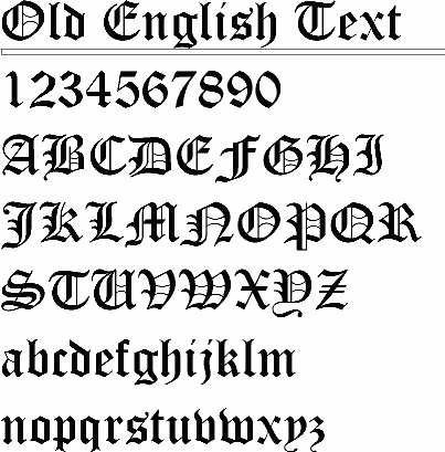
Historical Text Type Style (represented as Old English type)
Commonly used for formal announcements
and invitations to weddings, graduations, and receptions.

Roman Type (Serif)
Style
Used for long passages. This type
style is easy to read and has serifs on the letters.

Sans-Serif Type Style
This type style is used in books,
magazines, and newspapers.

Square-Serif Type Style
This typeface is used for headlines
and letterheads where a small amount of reading is required.

Script Type Style
This is used for advertisements,
announcements, and invitations. It has a personal handwriting look.

Novelty Type Style
This is the “catch-all” type style. It
includes those types that do not fit into the other five classifications.
No comments:
Post a Comment